10 Powerful Examples of Visual Imagery to Enhance Your Content in 2025
Discover 10 powerful examples of visual imagery from literature, ads, and design. Learn how to use visual language to make your content more compelling.
Visual imagery is more than just a literary device; it's a powerful tool for communication that transforms abstract ideas into vivid, memorable experiences. It’s the art of using descriptive language to create a mental picture, engaging the reader's sense of sight to evoke emotion, clarify complex concepts, and build a stronger connection with the message.
From classic literature to modern advertising, effective visual imagery separates forgettable content from impactful storytelling. In this guide, we will explore a diverse collection of examples of visual imagery across various mediums, including UX design, marketing, and film. We will break down the specific strategy behind each example, providing actionable takeaways you can apply to make your own writing more dynamic and engaging.
Whether you're a student refining an essay, a marketer crafting a campaign, or a professional preparing a report, mastering these techniques will elevate your communication. We will analyze everything from color psychology and strategic typography to interactive visual elements and data visualization. By understanding how these concepts work in practice, you can learn to paint a clearer, more compelling picture for your audience.
1. Color Contrast and Readability
Color contrast is a fundamental example of visual imagery that leverages the difference between foreground and background colors to enhance clarity and direct focus. It's a strategic visual tool that ensures text and other elements are easily distinguishable, making content more accessible and digestible. This technique goes beyond simple aesthetics; it’s about creating an intuitive visual hierarchy that guides the user's eye, improving both comprehension and user experience.
Strategic Application
Effective contrast is a cornerstone of modern digital design, seen everywhere from Apple’s minimalist interfaces to Google's Material Design. A marketing landing page, for instance, uses a brightly colored call-to-action button against a neutral background to draw attention and encourage clicks. Similarly, technical documentation often uses syntax highlighting with distinct colors to make code blocks scannable and easier to debug.
Actionable Takeaways
To effectively implement this technique:
- Test Your Ratios: Use tools like the WebAIM Contrast Checker to ensure your color pairings meet accessibility standards (WCAG). For a deeper understanding of ensuring text and visual elements are perceivable by all users, refer to this comprehensive guide to color contrast accessibility.
- Prioritize Hierarchy: Use high contrast for the most critical information, such as headlines and primary actions, to create a clear visual path for the reader.
- Maintain Brand Integrity: Select accessible color combinations that still align with your brand's established palette.
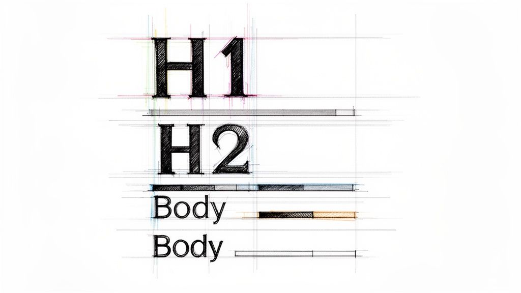
2. Strategic Typography and Font Hierarchy
Strategic typography is a powerful example of visual imagery that uses font size, weight, and style to build a clear informational structure. It organizes text into a logical hierarchy, guiding the reader’s eye from the most important headlines to supporting details. This technique transforms a simple wall of text into a scannable, intuitive, and engaging experience, making complex information easier to digest and retain.
Strategic Application
This principle is fundamental across various media. Academic papers use distinct heading levels (H1, H2, H3) to structure arguments, while marketing blogs employ bold, oversized subheadings to break up content and highlight key benefits. In business reports and professional documents, a well-defined font hierarchy separates sections, making dense data navigable. This visual organization ensures readers can quickly find relevant information and understand the relationships between different content blocks.
Actionable Takeaways
To effectively implement this technique:
- Establish a Clear Scale: Create distinct visual differences between your headline, subheadings, and body text. A common practice is to make your H1 roughly double the size of your body font.
- Limit Your Fonts: Stick to a maximum of 2-3 complementary fonts to avoid visual clutter. One serif and one sans-serif font often create a balanced and professional look.
- Prioritize Readability: Ensure adequate line spacing, typically 1.5 to 2 times the font size, to improve legibility and reduce reader fatigue, especially for long-form content. For more insights on creating effective typographic systems, Matthew Butterick's Practical Typography is an excellent resource.
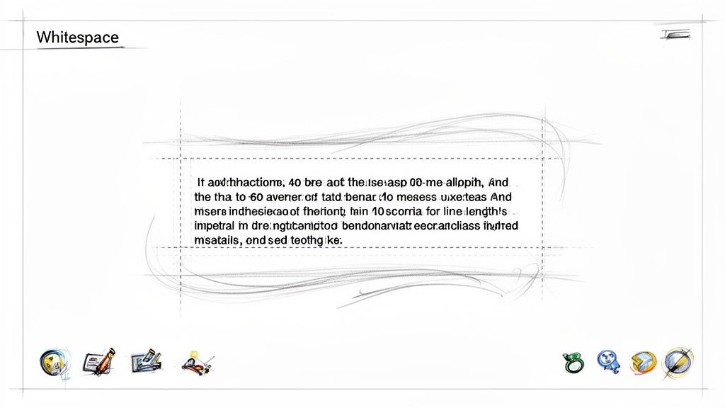
3. Whitespace and Breathing Room
Whitespace, or negative space, is the strategic use of empty areas around visual elements and text to enhance focus and reduce cognitive load. This is one of the most powerful examples of visual imagery where the absence of content directs attention to what is present. It creates a sense of sophistication and clarity, allowing key information to stand out without competing for the viewer's attention, making content feel more approachable and professional.
Strategic Application
Effective use of whitespace is a hallmark of clean, modern design. Apple’s product pages masterfully use generous spacing to create a premium, uncluttered feel that highlights the product itself. Similarly, popular blogging platforms like Medium.com employ wide margins and ample line spacing to make long-form articles more readable and less intimidating. This technique signals quality and guides the reader’s focus, transforming dense information into a calm, digestible experience.
Actionable Takeaways
To effectively implement this technique:
- Control Line Length: Aim for 40-60 characters per line to prevent eye strain and improve reading rhythm. This makes text blocks less daunting.
- Increase Line Height: Use a line-height multiplier between 1.5 and 1.8. This adds vertical breathing room between lines of text, significantly boosting readability.
- Separate Content Blocks: Add substantial empty space around paragraphs, images, and headings to create a clear visual hierarchy and guide the user's eye through the content.
4. Infographics and Data Visualization
Infographics and data visualization are powerful examples of visual imagery that transform complex information, statistics, and data into easily understandable graphics. This technique uses charts, graphs, and icons to tell a story, making dense information accessible and engaging. Instead of presenting readers with overwhelming text, it offers a visual pathway to comprehension, which is crucial for retaining attention in academic, marketing, and professional contexts.
Strategic Application
This technique is a staple in modern content strategy, used by organizations like HubSpot and Statista to simplify marketing trends and statistical data. For instance, a consulting firm like McKinsey & Company uses sleek dashboards and charts to present industry analysis, allowing clients to grasp key findings at a glance. Similarly, educational platforms like TED-Ed use animated diagrams to break down scientific concepts, making learning more intuitive and memorable for a broad audience.
Actionable Takeaways
To effectively implement this technique:
- Focus on a Core Message: Design your infographic around a single, clear takeaway. Avoid cluttering the visual with too much information, which can defeat its purpose.
- Maintain Brand Consistency: Use a color palette and typography that align with your brand identity to ensure a cohesive and professional look across all materials.
- Prioritize Accessibility: Include descriptive alt text for all images to ensure screen readers can interpret the visual information for users with visual impairments. For more on creating effective and accessible visuals, explore these content creation best practices.
5. Color Psychology and Emotional Response
Color psychology is a powerful form of visual imagery that uses specific hues to intentionally evoke emotions and create psychological associations. This technique is built on the understanding that colors can influence mood, perception, and behavior, allowing creators to reinforce their message without words. It's a strategic tool used to align visual elements with a desired brand identity or emotional tone, making content more impactful and memorable.
Strategic Application
Brand identity is deeply tied to color psychology. LinkedIn’s professional blue, for example, is used to build a sense of trust and reliability, which is essential for a professional networking platform. Similarly, Amazon’s signature orange in its branding and call-to-action buttons creates a feeling of urgency and energy, encouraging quick purchasing decisions. Evernote uses green to suggest growth, organization, and productivity, aligning perfectly with its note-taking function.
Actionable Takeaways
To effectively leverage color psychology in your work:
- Align with Your Message: Select colors that match the emotional intent of your content. For instance, use warm colors like red or orange for energetic marketing copy and cool colors like blue or green for calm, informative reports.
- Research Your Audience: Color perceptions can vary across cultures and demographics. Research your target audience to ensure your chosen palette resonates positively and avoids unintended negative associations.
- Create Powerful Palettes: To effectively utilize the emotional and psychological impact of specific hues in your designs, exploring powerful color combinations in design can help you build palettes that are both aesthetically pleasing and strategically effective.
6. Before-and-After Visual Comparisons
Before-and-after comparisons are a powerful form of visual imagery that showcases transformation through a direct, side-by-side presentation. This technique instantly communicates value by highlighting the tangible impact of a product, service, or process. It works by creating a clear narrative of improvement, making abstract benefits like "enhanced clarity" or "better design" concrete and immediately understandable to the audience.
Strategic Application
This method is a staple in industries where results are paramount. Skincare brands use it to display clearer skin, fitness programs show dramatic body transformations, and home renovation shows reveal stunning makeovers. In the digital realm, a software company might use a split-screen image to compare an old, cluttered user interface with its new, streamlined version. This visual proof builds trust and simplifies complex value propositions into a single, compelling image.
Actionable Takeaways
To effectively implement this technique:
- Highlight Key Changes: Use annotations, callouts, or highlighting to draw the viewer's eye to the most significant improvements between the two versions.
- Include Supporting Metrics: Quantify the transformation whenever possible. For a rewritten text, this could include showing changes in readability scores, word count, or AI detection ratings.
- Maintain Authenticity: Use genuine, real-world examples. Authentic transformations, even if less dramatic, are often more credible and relatable than overly polished or staged comparisons.
7. Visual Brand Identity and Consistency
Visual brand identity is a powerful form of visual imagery that uses a cohesive system of logos, colors, typography, and design elements to create immediate recognition. This consistent visual language communicates a brand's personality and values without words, fostering trust and familiarity. It ensures that every consumer touchpoint, from a website to a social media post, feels unified and intentionally crafted, solidifying the brand's presence in the market.
Strategic Application
This principle is expertly demonstrated by brands like Coca-Cola, whose iconic red and white color scheme and Spencerian script are instantly recognizable worldwide. Similarly, Google's Material Design system creates a consistent, intuitive user experience across its vast suite of products, using primary colors and clean typography. Buffer also maintains a friendly and approachable feel through its consistent use of soft color palettes, clean layouts, and specific illustration styles across its blog and application.
Actionable Takeaways
To build a strong visual brand identity:
- Establish Clear Guidelines: Create a comprehensive document that outlines your logo usage, color palette, typography, and imagery style. To get started, explore this detailed brand style guide template.
- Conduct Regular Audits: Periodically review all public-facing materials to ensure they align with your established brand standards and correct any inconsistencies.
- Automate Where Possible: Use tools that can automatically apply brand styling to content, ensuring that even rewritten or repurposed materials maintain a professional, consistent look.
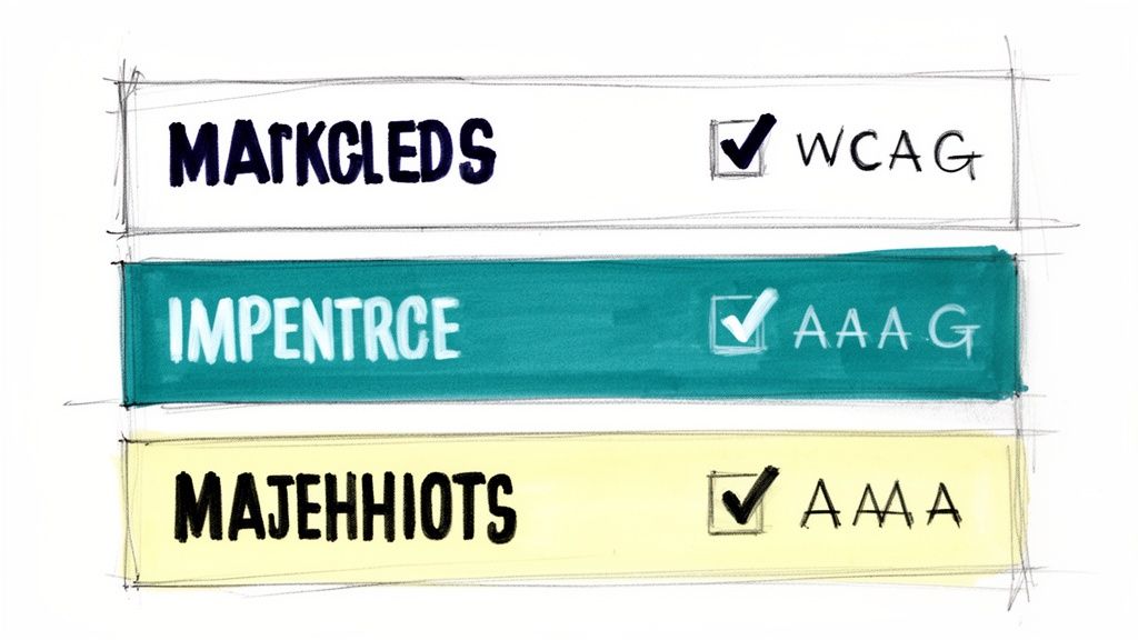
8. Visual Accessibility and Inclusive Design
Visual accessibility is a crucial practice in inclusive design, ensuring that visual content is usable by everyone, including individuals with disabilities. This approach involves creating visual imagery and interfaces that are perceivable, operable, and understandable for all users, regardless of their physical or cognitive abilities. More than a compliance checkbox, it is a design philosophy that broadens audience reach and improves the user experience for every single person.
Strategic Application
Organizations like Microsoft and the BBC have pioneered inclusive design by embedding accessibility into their core principles. For example, government websites that adhere to WCAG (Web Content Accessibility Guidelines) use semantic HTML and proper heading hierarchies to create a logical structure that screen readers can easily navigate. Similarly, The A11y Project provides community-driven resources that help creators implement these standards effectively, turning abstract rules into practical design solutions.
Actionable Takeaways
To integrate visual accessibility into your work:
- Provide Text Alternatives: Use descriptive alt text for all meaningful images to convey their content and function to users of screen readers.
- Ensure Sufficient Contrast: Test color combinations to ensure text and important graphical elements are easily distinguishable, meeting at least WCAG AA standards.
- Design for Multiple Inputs: Make sure all functionality is available via a keyboard, not just a mouse, to support users with motor impairments. For deeper insights, Microsoft's Inclusive Design principles offer a foundational guide.
9. Emotional and Narrative Imagery
Emotional and narrative imagery uses compelling visuals like photographs or illustrations to tell a story and forge a deep connection with the audience. This type of visual imagery moves beyond simply showing a product; it frames the brand within a larger, more meaningful context. By evoking feelings like joy, empathy, or inspiration, it transforms passive viewers into an engaged community that shares the brand's values.
Strategic Application
Purpose-driven brands master this technique to build loyalty. Patagonia’s campaign visuals don't just display outdoor gear; they tell stories of environmental activism and adventure, creating a narrative of conservation. Similarly, Dove's 'Real Beauty' campaign used authentic portraits to challenge industry standards, connecting with millions by telling a powerful story of self-acceptance and inclusivity. These brands sell an identity, not just a product.
Actionable Takeaways
To effectively implement this technique:
- Prioritize Authenticity: Use visuals that feel genuine and relatable. Showcase real people and unscripted moments to build trust and credibility.
- Align Visuals and Copy: Ensure your images and text work together to tell a cohesive story. The emotional tone of your visuals should match the message in your copy. For more on creating this synergy, explore these SEO copywriting best practices.
- Show, Don't Just Tell: Use imagery to demonstrate your brand's impact and values rather than just stating them. A photo of a community project in action is more powerful than a simple claim.
10. Interactive and Responsive Visual Elements
Interactive and responsive visuals are dynamic elements that change based on user input or screen size, creating a personalized and fluid experience. This type of visual imagery transforms a static interface into a dynamic conversation between the user and the platform. Instead of just presenting information, it invites participation, making digital environments feel more intuitive, engaging, and alive.
Strategic Application
This technique is at the core of modern user experience design. Consider Spotify’s personalized playlist interface, where cover art dynamically arranges itself based on the device, or how Slack's interactive onboarding guides new users with responsive tips and animations that react to their progress. Figma's collaborative tools offer another powerful example, with cursors and design elements moving in real-time, providing immediate visual feedback that enhances teamwork and clarity.
Actionable Takeaways
To effectively implement this technique:
- Prioritize Performance: Ensure animations and transitions are smooth and optimized. Use efficient code and test across various devices to prevent lag that can disrupt the user experience.
- Design for Accessibility: All interactive elements must be fully navigable using a keyboard. Ensure that any information conveyed through interaction is also available to users of assistive technologies.
- Implement Graceful Fallbacks: Provide a functional experience for users who may have JavaScript disabled or are using older browsers. The core content and functionality should always remain accessible.
Comparison of 10 Visual Imagery Examples
| Technique | Implementation Complexity | Resource Requirements | Expected Outcomes | Ideal Use Cases | Key Advantages |
|---|---|---|---|---|---|
| Color Contrast and Readability | Low–Medium — color selection and testing | Color tools, contrast checker, basic design/dev work | Improved readability and accessibility; clearer hierarchy | Docs, blogs, marketing pages, technical content | Better accessibility, reduced eye strain, consistent clarity |
| Strategic Typography and Font Hierarchy | Medium — type system and CSS rules | Font licenses, style guide, cross-platform testing | Clear hierarchy, scannability, professional tone | Academic papers, reports, long-form articles | Guides attention, improves readability and semantics |
| Whitespace and Breathing Room | Low — layout and spacing adjustments | Templates, responsive layout testing | Lower cognitive load; perceived premium quality | Articles, product pages, reports, editorial layouts | Increases comprehension, polished appearance |
| Infographics and Data Visualization | High — design and data preparation | Designers, visualization tools, data sources | Simplified complex information; higher engagement | Marketing, research summaries, presentations | Clarifies data, highly shareable, improves retention |
| Color Psychology and Emotional Response | Medium — strategy and testing | Brand strategy, user research, A/B testing | Emotional alignment with messaging; influences behavior | Branded campaigns, CTAs, marketing content | Enhances recognition and persuasion when tested |
| Before-and-After Visual Comparisons | Medium — layout and authentic assets | Original + improved assets, designer or comparison tools | Demonstrable value and impact; persuasive evidence | Case studies, demos, conversion pages | Shows concrete improvement, builds credibility |
| Visual Brand Identity and Consistency | High — system creation and governance | Brand guidelines, asset library, training | Cohesive recognition; scalable content production | Agencies, enterprises, cross-channel branding | Strengthens trust, simplifies scaling and workflows |
| Visual Accessibility and Inclusive Design | Medium–High — standards implementation | Accessibility experts, testing tools, training | Broader audience reach; legal and UX compliance | Government, education, corporate sites, public-facing content | Expands audience, reduces legal risk, improves SEO |
| Emotional and Narrative Imagery | High — production and creative direction | Photographers, illustrators, video producers | Strong emotional connection; higher engagement | Story-driven campaigns, advocacy, brand marketing | Deepens engagement, memorable and shareable content |
| Interactive and Responsive Visual Elements | High — development and UX work | Developers, UX designers, performance testing | Increased engagement, personalized interactions, analytics | SaaS, educational platforms, product demos | Improves retention, enables progressive disclosure and data capture |
From Imagery to Impact: Making Your Words Visible
Throughout this exploration, we've journeyed across a diverse landscape of visual communication, analyzing ten distinct examples of visual imagery. We've moved from the foundational mechanics of color contrast and typography to the sophisticated strategies behind data visualization, emotional narratives, and interactive design. The central theme connecting these varied examples is undeniable: visual language is not merely decorative; it is a critical component of powerful communication.
Effective imagery transforms abstract ideas into concrete experiences. It guides the reader’s eye, clarifies complex information, and forges an emotional connection that words alone often cannot achieve. The strategic use of whitespace creates focus, while consistent brand identity builds trust and recognition. Each example serves as a testament to the idea that thoughtful visual choices are essential for amplifying your core message and ensuring it resonates deeply with your audience.
Synthesizing Your Visual Strategy
The key takeaway is that great writing deserves an equally great presentation. The words you craft and the visuals you choose should never be in conflict. Instead, they must work in concert to tell a single, cohesive, and compelling story. As you move forward, consider the following actionable steps to integrate these principles into your own work:
- Conduct a Visual Audit: Use the concepts we've discussed as a checklist. Review your existing content, whether it's a blog post, a business proposal, or a landing page. Where can you improve color contrast for better readability? Is your typography hierarchy clear? Are you using infographics to simplify data?
- Prioritize a Single Goal: For each piece of content, determine the primary objective. Is it to inform, persuade, or evoke emotion? Let this goal dictate your visual choices. For an analytical report, data visualization is key. For a brand story, emotional and narrative imagery will be far more effective.
- Embrace Iteration and Feedback: Visual communication is not an exact science. Test different approaches. See how your audience responds to a before-and-after comparison versus a detailed infographic. Use feedback to refine your strategy and better understand what captures and holds your audience's attention.
Mastering these techniques will elevate your content from a simple text document into a rich, memorable, and multi-sensory experience. By deliberately applying these examples of visual imagery, you build a more profound connection with your readers, making your message not just seen, but felt and understood. This strategic fusion of word and image is the hallmark of truly impactful communication in today's visually-driven world.
Ready to ensure your written content is as polished and powerful as your visuals? Use Rewritify to refine your text, perfect your tone, and create professional, engaging drafts that seamlessly complement your visual strategy. Transform your ideas into impeccably written content at Rewritify.
Relevant articles
Explore an example of diction and master seven essential types to sharpen tone, voice, and clarity in your writing.
Discover how a powerful AI text enhancer can elevate your writing. Learn to improve clarity, refine your tone, and boost productivity with practical tips.
Discover 10 actionable content repurposing strategies to maximize your reach and ROI. Turn blogs, webinars, and data into powerful marketing assets.