How to Write a Project Report That Gets Results
Learn how to write a project report that commands attention and drives action. This guide provides practical steps, formats, and writing techniques for success.
A project report is more than just a document; it's the story of your project. It's where you translate complex data and activities into a clear, logical narrative for stakeholders, explaining what you did, why you did it, and what it all means.
Why a Great Project Report Is Your Most Powerful Tool
Let's be honest—project reports often feel like a tedious chore you have to complete after all the real work is done. But shifting that mindset is key. Think of your report not as an obligation, but as a strategic asset. A well-crafted report is far more than a summary; it's a powerful tool that demonstrates your competence, justifies crucial decisions, and can even secure funding for your next big idea.
The difference between a mediocre report and a truly great one is night and day. A poorly written document can bury valuable insights in jargon, creating confusion and turning stakeholder meetings into painful interrogations. On the other hand, a clear, data-driven report transforms those same meetings into productive discussions that build trust and drive decisive action.
The Strategic Advantage of Clear Reporting
Mastering this skill is essential if you're serious about making an impact. I've seen it firsthand: a clear report can be the single deciding factor in whether a pilot program gets scaled up or shelved entirely. It provides the hard evidence needed to back up your claims and persuade the people holding the purse strings. In an academic context, it's the primary way to prove your research's validity.
The numbers don't lie. Research shows that a staggering 65% of projects get derailed along the way, and globally, only about 35% are considered fully successful.
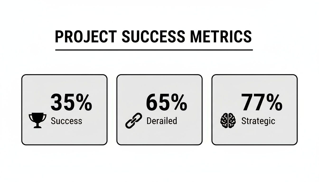
Here's the kicker: 77% of high-performing organizations understand that clear reporting is a strategic competency, not just an administrative task. This focus directly contributes to better outcomes and fewer failures.
The quality of your report directly influences how your project's performance is perceived and what happens next. A clear, professional report can salvage a struggling project or amplify a successful one, whereas a poor report can undermine even the best results.
The Impact of Report Quality on Project Outcomes
| Attribute | Poor Report | Effective Report |
|---|---|---|
| Clarity | Vague language, jargon-filled, and confusing. | Clear, concise, and easy for any stakeholder to understand. |
| Data Presentation | Data is buried in text or presented without context. | Key metrics are highlighted with charts and visuals. |
| Stakeholder Confidence | Erodes trust and creates more questions than answers. | Builds confidence and demonstrates project control. |
| Decision-Making | Leads to indecision or poor choices based on confusion. | Empowers fast, informed, and data-driven decisions. |
| Project Legacy | Obscures lessons learned and hinders future planning. | Creates a valuable blueprint for future projects. |
This table illustrates that a project report isn't just a formality—it's an active participant in the project's success. It shapes perception, guides decisions, and lays the groundwork for what comes next.
A project report isn't just a historical record. It's a persuasive argument for your team's competence, a justification for the resources you used, and a blueprint for future success.
Ultimately, learning to write an effective project report is a core leadership skill. Anyone wondering how to be a successful project manager needs to master this art of communication. It's your best opportunity to control the narrative, showcase your work’s value, and build a reputation for reliability and excellence.
Laying the Groundwork for a Winning Report
Before you even think about writing the first sentence, the real work of crafting a great project report begins. I’ve seen it time and time again: solid preparation is what separates a report that gets results from one that gets ignored.
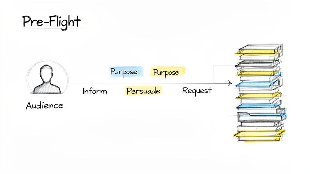
Think of this initial phase as your pre-flight checklist. Getting these foundational pieces right turns a potentially overwhelming task into a straightforward process of connecting the dots you've already laid out.
It all starts with a simple question: who is this for? The answer changes everything—your tone, the language you use, and how deep you go into the details. An executive team, for instance, is looking for a 30,000-foot view focused on outcomes and ROI. Your technical team, on the other hand, needs all the granular data and methodological specifics. Getting your audience wrong is the quickest way to lose them.
Defining Your Report's Core Purpose
Once you know your audience, you need to lock in your "why." Every single project report should have a primary objective that steers its content and structure.
Are you simply updating stakeholders on progress? Or are you building a case to persuade them to greenlight a budget increase? Maybe the goal is to get a specific action approved, like a critical change in the project's scope.
Nailing this down from the start gives you a North Star. It keeps your writing focused and ensures every word serves a purpose. Without a clear goal, a report can quickly devolve into a rambling collection of facts that leads nowhere.
Common report objectives I see are:
- To Inform: Give a clean, factual update on project status, key milestones, and performance metrics.
- To Persuade: Make a compelling argument for a decision, like adopting a new strategy or allocating more resources.
- To Request Action: Clearly state what you need and outline the exact steps you want the reader to take.
For a more structured way to approach your report's design, the ADDIE model can be a huge help. It’s a systematic framework that forces you to analyze and design thoroughly before you jump into writing, making sure you don't miss any crucial components.
Your report’s purpose isn't just a formality; it's the lens through which every piece of data should be presented. If a detail doesn't support your core objective, it's probably noise that should be cut.
Gathering and Organizing Your Information
With your audience and purpose clear, it's time to gather your raw materials. This means pulling together all the relevant data, feedback, and project documents before you start outlining. Trust me, doing this now saves you from constantly stopping your writing flow to hunt for a missing file or statistic later.
Here’s what effective data gathering looks like:
- Quantitative Data: Pull the hard numbers—budget variance, timeline adherence, key performance metrics, and completion rates.
- Qualitative Data: Collect stakeholder feedback, notes from team meetings, risk assessments, and any documented "lessons learned."
- Visuals and Evidence: Grab progress photos, screenshots of key deliverables, or charts and graphs from your initial analysis.
After you've collected everything, sort it into logical buckets that mirror your report's eventual structure. I like to think of it as mise en place for cooking—get all your ingredients prepped and sorted first. This makes the next step, outlining, a breeze. A deep understanding of your data is also crucial for explaining how the project was executed. If you need a refresher, you can learn more about how to write a methodology in our detailed guide.
Building Your Structural Blueprint
The last piece of the puzzle is your outline. This is the architectural blueprint for your report. Skipping this step is the most common mistake I see, and it almost always leads to a disorganized, rambling document.
A solid outline forces a logical flow, acts as a checklist so you don’t forget key points, and breaks the writing process down into smaller, more manageable chunks.
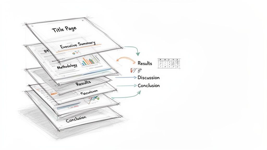
Start with the major sections—Introduction, Methods, Results, Discussion, Conclusion—and then flesh them out. Use bullet points under each heading to map out the specific information, data, and arguments you’ll include. This roadmap doesn't just guide your writing; it helps you see the story your report is telling from start to finish, ensuring it’s both coherent and persuasive.
Mastering the Anatomy of a Project Report
Every powerful project report is built on a logical, predictable foundation. This structure isn’t just about following old-school rules; it’s a time-tested framework that walks your reader from the 30,000-foot view right down to the nitty-gritty details. Getting this right ensures your message is clear, persuasive, and, above all, professional.
Let's break down this structure piece by piece. Understanding the role of each component is the first real step in turning that daunting blank page into a compelling story of your project's journey.
This quick-reference table outlines the essential building blocks of a high-impact project report.
Essential Components of a Project Report
| Section | Purpose | Key Elements |
|---|---|---|
| Title Page | Professionalism and identification. | Project title, author(s), organization, submission date, recipient. |
| Executive Summary | A standalone overview for busy stakeholders. | Core problem, key findings, major conclusions, and top recommendations. |
| Introduction | Sets the context and outlines the project's purpose. | Background, problem statement, project objectives, and scope. |
| Methodology | Explains how the project was executed to build credibility. | Procedures, tools, data collection techniques, and analytical methods. |
| Results | Presents the objective findings without interpretation. | Raw data, key metrics, and outcomes, often using charts and tables. |
| Discussion | Interprets the results and explains their significance. | Analysis of findings, connection to objectives, and acknowledgment of limitations. |
| Conclusion | Summarizes the project's key takeaways. | A brief restatement of the purpose, main findings, and final thoughts. |
| Recommendations | Provides actionable, data-backed next steps. | Specific, clear suggestions for future actions based on the findings. |
| References/Appendices | Provides supporting information and cites sources. | List of cited works, raw data, detailed charts, or supplementary documents. |
Each part plays a distinct role in telling your project’s story effectively. Now, let’s look at what goes into each one.
First Impressions: The Title Page and Executive Summary
Long before anyone dives into your data, they'll see the title page and the executive summary. Think of these as the gatekeepers of your report. They set the tone and can be the deciding factor in whether someone reads on with genuine interest or just gives it a quick skim. A strong start is everything.
The Title Page is simple but non-negotiable for a professional look. It needs to clearly state:
- The project’s full title
- The author(s) and their organization
- The date of submission
- The recipient or intended audience
Next up is the Executive Summary—and it's arguably the most critical real estate in your entire report. This is your project’s elevator pitch. I’ve seen countless projects where senior leaders only read this section, so it absolutely has to stand on its own and punch hard. It must boil down your entire project into a compelling, easy-to-digest snapshot. For a deeper dive into nailing this high-stakes section, our guide on how to write executive summaries has some great, practical techniques.
Setting the Scene: The Introduction
Right after the summary, the Introduction gives your reader the context they need to understand everything that follows. This is where you lay out the "what" and the "why" of the project. Your job here is to get everyone on the same page, making sure they understand the problem you tackled and what you were hoping to achieve.
A solid introduction typically covers:
- Background Information: A brief rundown of the situation. What problem or opportunity kicked off this work in the first place?
- Problem Statement: A clear, sharp declaration of the specific issue your project was designed to address.
- Project Objectives and Scope: What were your specific, measurable goals? Just as important, what were the project's boundaries? Be clear about what was in—and what was out.
Keep your results and conclusions out of this section. The introduction is the roadmap, telling your reader where you're going and why the journey matters.
Detailing the "How": The Methodology
The Methodology section is where you build credibility. It’s your chance to pull back the curtain and explain precisely how you did the work. Here, you detail the specific processes, tools, and techniques you used to gather and analyze your data. This part needs to be so clear that another professional in your field could, in theory, replicate your work—that’s the gold standard for transparency.
Whether your project was a software build, a marketing campaign, or a scientific study, you need to walk through the steps you took. You might describe the survey instrument you designed, the specific coding languages you used, or the lab protocols you followed. This transparency is what makes your findings trustworthy.
Presenting the Facts: The Results
This is where you present your findings—and only the findings. The Results section is about laying out the raw data and outcomes objectively, without any of your own interpretation or spin. You’re simply delivering the "what happened" part of the story. Using a mix of plain text, tables, and visuals is the best way to do this clearly.
Let the data do the talking. Use clean headings to break up different sets of findings. For example, if you’re reporting on a website redesign, you might have subheadings like "User Traffic Analysis," "Engagement Metrics," and "Lead Conversion Rates." And remember, visuals are your best friend here. A sharp-looking chart can communicate a complex data set way more effectively than a wall of text ever could.
Interpreting the Meaning: The Discussion
If the Results section is about what you found, the Discussion is all about what it means. This is where you finally get to connect the dots and move from simply presenting data to actually interpreting it. You’ll link your findings directly back to the project objectives you laid out in the introduction and analyze the real-world implications.
In the Discussion, you should:
- Analyze Your Findings: Go beyond the surface-level numbers. What trends or patterns jumped out at you? Were there any results that completely surprised you?
- Acknowledge Limitations: No project is perfect. Being upfront about any constraints or limitations of your approach shows integrity and a high level of critical thinking. It actually strengthens your report.
- Connect to Objectives: Explicitly explain how your results address the problem you set out to solve. Did you hit your targets? If so, great. If not, why not?
This is the analytical heart of your report. It’s where you prove you can think critically about what the project actually accomplished.
Wrapping It Up: Conclusion and Recommendations
Finally, the Conclusion ties everything together with a bow. This should be a tight, concise summary of the report's most important takeaways. Don't introduce any new information here. Instead, briefly restate the project's purpose, hit your most significant findings one last time, and offer a final thought on the project's overall success.
Right after the conclusion comes the Recommendations section, which is all about action. Based on everything you’ve presented, what should happen next? Each recommendation should be a clear, actionable suggestion that flows directly from your findings.
And don't forget the final bits: References and Appendices. The References page lists all the sources you cited, which is crucial for credibility. The Appendices are the home for any supplementary materials—think raw data tables, lengthy survey questions, or detailed charts that would have cluttered the main body of the report. Put together, these components create a complete, professional, and truly persuasive project narrative.
Writing Techniques That Build Credibility and Trust
A solid structure gives your report a skeleton, but your writing gives it a voice. This is where you go from just presenting facts to actually building trust in your findings. The quality of your writing is what makes your message land with authority instead of getting lost in a sea of corporate-speak.
Let's be clear: great report writing isn't about using the biggest words in the dictionary. It’s about making complex information feel simple and accessible. Here are a few techniques I’ve learned over the years to help you strike that perfect balance between a confident, objective tone and easy readability.
Embrace Clarity and Simplicity
The fastest way to lose your reader? Hide behind jargon and convoluted sentences. Your primary goal is to communicate, not to show off your vocabulary.
- Ditch the Jargon: Unless you’re absolutely certain every single reader is a specialist, swap out technical acronyms and niche terms for plain English. If you have to use a specific term, just give a quick definition the first time.
- Keep Sentences Punchy: Long, winding sentences are a chore to read. Break down your big ideas into shorter, more direct statements. A good rule of thumb is one main idea per sentence.
- Use Simple Words: Why say "utilize" when "use" works just fine? Using straightforward language is a sign of confidence. It shows you respect your reader's time.
Think of it this way: clear writing proves you understand your topic inside and out—so well, in fact, that you can explain it to almost anyone. This is a huge part of what experts call text fluency.
Write with an Active Voice
This is one of my favorite tips because it instantly makes your writing more dynamic. Using an active voice makes it crystal clear who is doing what, which creates a much stronger and more direct report.
Passive voice often sounds weak, or worse, evasive. "Mistakes were made during the data analysis." It just hangs there. Who made them?
Active voice is direct and confident. "The research team made mistakes during the data analysis." See the difference? It's transparent and takes ownership.
Before (Passive): "The user interface was redesigned by the development team based on feedback that was received from stakeholders." After (Active): "The development team redesigned the user interface based on stakeholder feedback."
The active version is punchier, shorter, and just plain easier to understand. A quick editing pass just to hunt down and change passive sentences to active ones can dramatically improve your report.
Maintain an Objective Tone
A project report is a professional document, and your tone needs to match. An objective tone builds trust because it shows your conclusions are rooted in evidence, not your personal feelings or biases.
Here’s how to nail it:
- Focus on the Facts: Ground every statement in your data. Instead of, "The new feature was a huge success," you should write, "The new feature increased user engagement by 45% in its first month."
- Avoid Emotional Language: Words like "amazing," "terrible," or "unfortunately" sneak personal bias into your work. Let the numbers and the evidence do the talking.
- Consider the Third Person: Writing in the third person ("the team found" instead of "we found") can create a bit of formal distance. This helps reinforce objectivity and is often the standard in academic and many corporate settings.
This doesn't mean your writing has to be boring. It just means your credibility stems from the strength of your evidence—and that’s the foundation of any great project report. By mastering these writing techniques, you'll create a report that doesn't just inform, but truly persuades.
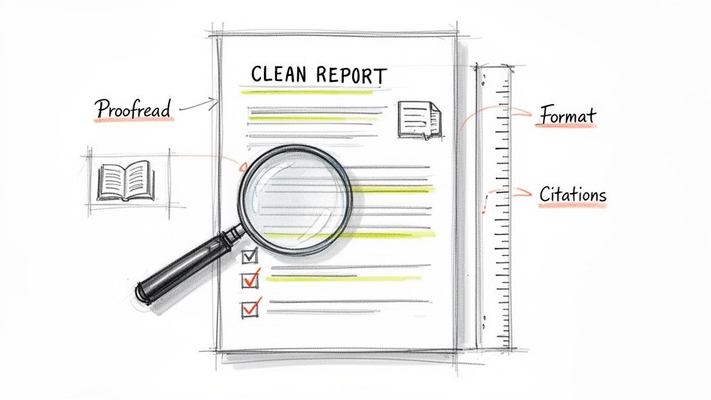
The Final Polish: What Separates a Good Report from a Great One
You’ve done the heavy lifting. The research is solid, the analysis is sharp, and the words are on the page. It's tempting to hit "send" and be done with it, but this last stretch—the final polish—is where you truly make your work shine. This is what separates a report that’s just done from one that’s genuinely impressive.
Little things like typos, wonky formatting, or a missing citation can quietly sabotage all your hard work. They chip away at your credibility before the reader even gets to your brilliant insights. Let's walk through how to put on that final professional gloss that ensures your report gets the respect it deserves.
Create a Clean and Scannable Layout
Before anyone reads a word, their eyes scan the page. A messy, chaotic layout immediately signals disorganization and can subconsciously bias them against your work. A clean, well-structured document, on the other hand, looks professional and invites them in.
Here’s where to focus your attention for a layout that looks sharp:
- Consistent Headings: Make sure all your main headings (H2s) and subheadings (H3s) look the same. A clear visual hierarchy is like a roadmap for your reader, guiding them through the structure of your argument.
- Readable Fonts: Don't get fancy. Stick with classic, professional fonts like Arial, Calibri, or Times New Roman. For the main body text, an 11 or 12-point font size is almost always the right call.
- Give it Room to Breathe: Use standard one-inch margins. This creates white space around your text, which prevents the page from feeling cramped and makes reading much less of a chore.
- Number Your Pages: It’s a simple thing, but adding page numbers is crucial for any report longer than a couple of pages. It makes it so much easier for readers to navigate and reference specific sections.
These aren't just minor details; they work together to create an immediate impression of professionalism and build trust with your audience.
Master Your Citations and References
Getting your citations right is non-negotiable. This is all about academic and professional integrity. When you properly credit your sources, you're not just avoiding plagiarism; you're also backing up your own arguments with credible, verifiable evidence.
Whether your guide calls for APA, MLA, Chicago, or something else, the golden rule is consistency. Every in-text citation must have a matching entry in your reference list, and the formatting for each needs to be identical.
A classic mistake I see all the time is having a source in the bibliography that isn't actually cited in the text, or vice-versa. Always do a final cross-check to make sure they match up perfectly.
Trying to manage all this by hand, especially in a long report, is a recipe for disaster. Do yourself a favor and use a citation management tool like Zotero, Mendeley, or EndNote. These programs plug right into your word processor and handle all the formatting automatically. They’ll save you hours of tedious work and prevent a ton of mistakes.
Use a Multi-Pass Proofreading Strategy
One quick scan before you submit is never enough. Your brain has a pesky habit of autocorrecting errors on the page, seeing what it thinks should be there instead of what actually is. To really catch everything, you need to be more methodical.
I’ve always found it best to proofread in a few separate passes, with each one focused on a different type of error.
The "Big Picture" Pass: Read through the entire report just for flow. Does the story make sense? Does each paragraph logically connect to the next? Forget about typos for now and just focus on the overall argument.
The "Grammar and Spelling" Pass: Now, go back and do a slow, careful read for grammar, spelling, and punctuation. Reading your text out loud is a game-changer here. Your ears will catch awkward phrasing and typos that your eyes might have skimmed right over.
The "Numbers and Names" Pass: This pass is all about the details. Meticulously verify every single number, date, statistic, and proper name. A single wrong digit can sink your credibility. Double-check that the data in your charts matches what you’ve written in the text.
The "Formatting" Pass: One last time, scroll through the document looking only at the visual elements. Are the headings consistent? Are the margins correct? Do the tables and figures look clean? Make sure the entire report looks polished from page one to the very end.
This approach might feel a bit over the top, but it’s the best way to guarantee that your final report is as flawless as it can be. This is the last bit of effort that protects all the work you’ve already invested, making sure your project gets noticed for all the right reasons.
Answering Your Top Questions About Project Reports
Even with the best template in hand, you’re bound to hit a few stumbling blocks while writing. I've seen it time and again. Let's clear up some of the most common questions that pop up, so you can finish your report with confidence.
How Long Should a Project Report Be?
Honestly, there's no magic number. I've written crisp one-pagers for simple weekly updates and delivered comprehensive reports that ran over 50 pages for major, year-long initiatives. The "right" length is whatever it takes to tell the full story to your specific audience.
The golden rule is clarity over clutter. Your report needs to be long enough to convey all the essential information but short enough to hold your reader's attention. Don't add fluff just to hit an imaginary page count.
Your report should be as long as it needs to be to tell the full story, and not a single word longer. If your manager or professor provided length guidelines, follow them. If not, focus on fulfilling the report's core objective thoroughly.
What Is the Difference Between the Discussion and Conclusion?
This is a classic point of confusion, and it’s a great question. They might sound similar, but they have very distinct jobs.
Think of the Discussion as the analytical heart of your report. This is where you roll up your sleeves and interpret the data. It's your chance to answer the big question: "So, what does all this mean?"
In the Discussion, you should be:
- Connecting your results directly back to the project's original goals.
- Exploring the real-world implications of your findings.
- Pointing out any limitations or surprises you encountered along the way.
The Conclusion, however, is the high-level summary. It zooms all the way out. Here, you briefly restate the core problem, present your most important findings, and offer the main takeaways. No new analysis, just the final verdict. The Discussion is the deep dive; the Conclusion is the executive summary at the end.
How Can I Make My Report Engaging for a Non-Technical Audience?
This is a crucial skill. When your audience isn't steeped in the technical details, you need to shift your focus from process to outcome.
Start by writing a powerful executive summary in plain English. Get straight to the results and your recommendations, skipping the heavy jargon.
Visuals are your best friend here. A simple chart or a well-designed infographic can communicate a complex idea much faster than a dense table of raw numbers. Research consistently shows that visuals boost comprehension.
Also, make a habit of defining any essential technical terms or acronyms the first time you use them. Sometimes a good analogy can work wonders for explaining a tricky concept. And don't forget the basics: use clear headings, keep paragraphs short, and leave plenty of white space. A clean, scannable document respects your reader’s time and makes your message stick.
Struggling to refine your report's language for clarity and impact? Rewritify helps you transform complex drafts into polished, professional text that's easy to read and plagiarism-safe. Perfect your report in just a few clicks at https://www.rewritify.com.
Relevant articles

Discover how to write a business report that gets read and acted on. This practical guide covers planning, drafting, and presenting data to drive decisions.